Mostrando entradas con la etiqueta mapas. Mostrar todas las entradas

domingo, 3 de enero de 2021

Maps Collection


Most of us do not, today, live in desperate need of maps. On the internet we can easily find not only the current maps we need to navigate most any territory on Earth, but also an increasing proportion of all the maps made before as well. You can find the latter in places like the David Rumsey Map Collection, which, as we wrote last year here on Open Culture, now boasts 91,000 historic maps free to download.  It will surely add even more, as humanity seems to have only just begun digitizing its own many attempts to make the physical world legible, an art that goes back (as you know if you read the University of Chicago’s The History of Cartography online) to prehistoric Lascaux cave paintings of the night sky.
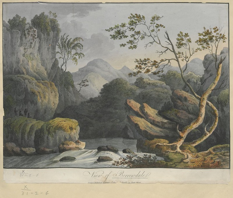
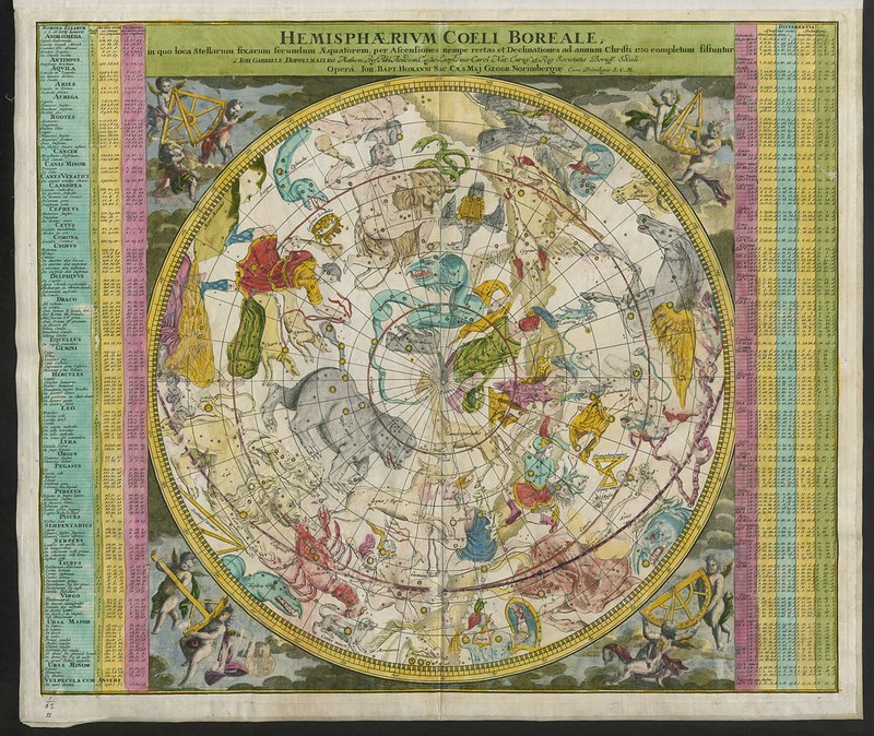
By that standard, the maps currently being digitized and uploaded by the British Library are downright modern — or early modern, to be more specific. Dating between 1500 and 1824, says Medievalists.net, these maps “are part of the Topographical Collection of King George III (K. Top),” which also includes “maps, atlases, architectural drawings, cartoons and watercolors.”


Part of “the larger King’s Library which was presented to the Nation by George IV in 1823,” the collection was amassed “during the formative period of the British Empire” and thus shows “how Britain viewed and interacted with the wider world during this period.”
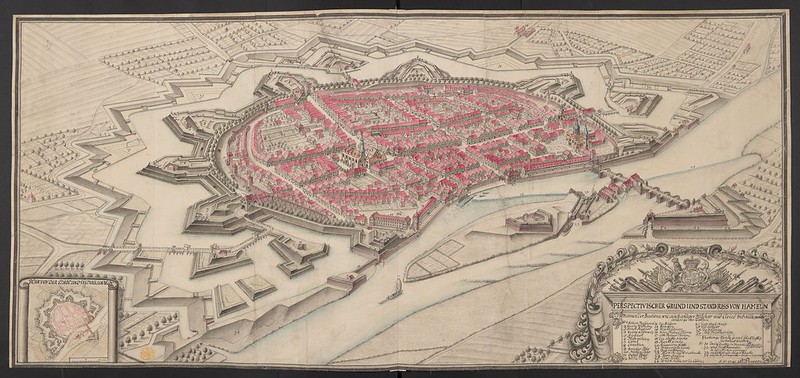
The British Library plans to post 40,000 of these maps (broadly considered), and you can now view the first set of roughly 18,000 at the institution’s Flickr Commons collection. Medievalists.net names as highlights of the full Topographical Collection of King George III such artifacts as “a hand-drawn map of New York City, presented to the future James II in 1664,” “The vast Kangxi Map of China of 1719 made by the Italian Jesuit Matteo Ripa,” “the earliest comprehensive land-use map of London from 1800,” and even “watercolors by noted 18th century artists such as Paul Sandby and Samuel Hieronymus Grimm.”
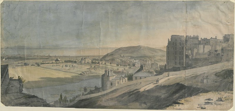
Many of the pieces the British Library has thus far uploaded to Flickr look like maps to us still today, but just as many, perhaps most, strike us more as works of art. This goes for traditional bird’s-eye-views rendered more vividly (and sometimes imaginatively) than we’re used to, as well for as richly drawn or even painted landscapes, all of which exist to provide a faithful representation of land, sea, and sky. You can view more such images along that spectrum, as well as read their stories in context, at the British Library’s Picturing Places site. The artistic and historical richness exuded by these maps today echoes the more tangible value they had when first created: back then, those who had the maps possessed the world.

Fuente htthttps://www.openculture.com/2020/11/40000-early-modern-maps-are-now-freely-available-online-courtesy-of-the-british-library.htmlps://www.openculture.com/2020/11/40000-early-modern-maps-are-now-freely-available-online-courtesy-of-the-british-library.html

jueves, 17 de diciembre de 2020

El mapa de lo que sabemos de la física

 Dominic Walliman explica en The Map of Physics, un vídeo de poco más de ocho minutos, los campos en los que se divide la física, convenientemente situados en un mapa para que sea más fácil ver cómo se relacionan unos con otros.

Incluye también el el abismo de la ignorancia, que es donde esperamos que esté la teoría unificada del todo que nos permita reconciliar de una vez las distintas formas que tienen de ver y de explicar el mundo la teoría de la relatividad y la física cuántica.

Tiene subtítulos en español, y también hay este mapa resumen en español hecho por Molasaber:

Mapa de la física por MolaSaber
Mapa de la física por MolaSaber - clic en la imagen para verla en grande

Se mete también en cuestiones de filosofía, por lo que mola aún más.

Compartir en Flipboard

PUBLICIDAD

domingo, 19 de abril de 2020

Cómo entender la distorsión de los mapas de forma interactiva


En Visualizing map distortion Mike Bostock y su equipo tienen una visualización interactiva del globo terráqueo en diversas proyecciones cartográficas. Basta elegir el tipo de proyección en el menú desplegable y moverse con el ratón para entender cómo se ve (izquierda) respecto a la realidad que se está viendo (derecha); el área delimitada por los puntos rojos es la misma.
Las diversas proyecciones incluyen las más comunes (Mercator, Cilíndrica, Winkel Tripel) y otras menos conocidas pero no por ellos menos ingeniosas. Dado que es matemáticamente imposible representar exactamente la superficie de una esfera en un plano sin distorsión, todo es cuestión de elegir la forma más adecuada –y menos distorsionada– para cada propósito.
Además del ejercicio divulgativo de esta gran herramienta hay mucho código para la representación gráfica que se puede reutilizar para otros proyectos.

viernes, 11 de septiembre de 2015

Un mapa geomorfológico ilustra cómo se formó la Sierra de Atapuerca.

Valles, terrenos al aire libre y llanos, y sobre todo las cuevas hacen de la Sierra de Atapuerca (Burgos) un lugar único, en el que habitaron al menos cuatro especies de homínidos y otros animales como el ciervo gigante, el jaguar europeo o el oso de las cavernas. Para entender cómo se creó este hábitat de gran valor paleontológico, un equipo del CENIEH ha logrado mapear la evolución del paisaje.


Mapa geomorfológico

miércoles, 4 de diciembre de 2013

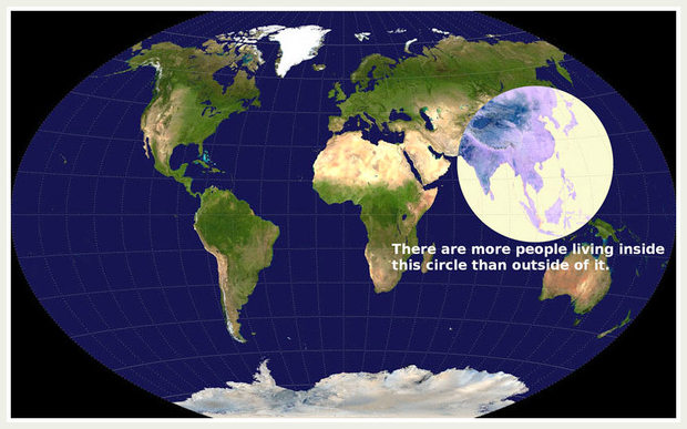
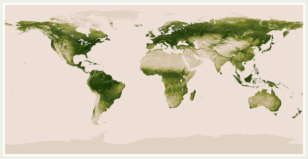
Mapas que cambian nuestra visión del mundo.

Estos mapas cambian nuestra visión del mundo.
Este por ejemplo representa la densidad de población mundial.
Image: Imgur

Mapa de la vegetación
Image: NASA/NOAA
Si quieres ver más visita el enlace.